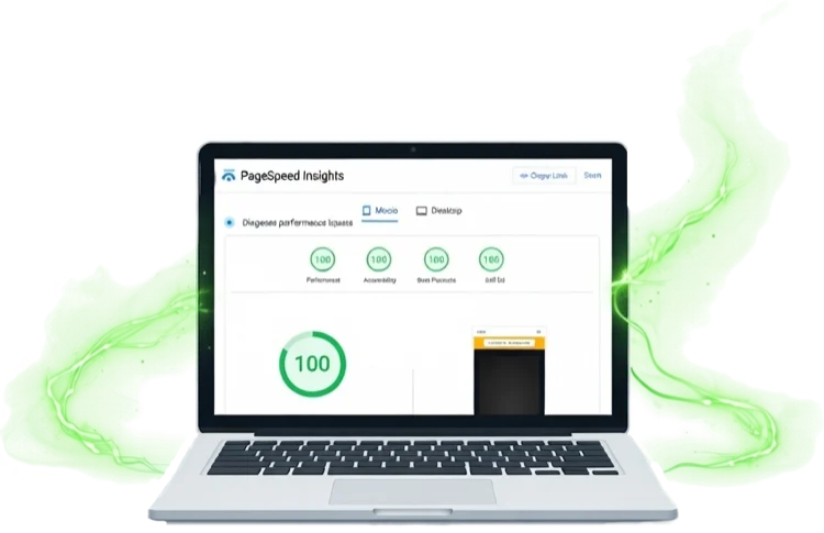
How We Score 100 100 100 100 on Google PageSpeed Insights — And Why It Matters
If you've ever Googled "PageSpeed Insights" — or maybe you couldn't quite remember the name and searched something like "Google website speed test"...
Convert PNG, JPG, WebP, GIF & BMP to next-gen AVIF — with optional responsive breakpoints for srcset. Drag in a batch, download in seconds.
Sitethreesixty is committed to privacy. We don't track you, set cookies, or store anything — we can't see your images and never could. This tool is completely free with no ads, no sign-up, and no popups.
How it works
srcset string.Why this tool exists
We built this tool for our own builds — we needed something that handled AVIF conversion, responsive breakpoints, and srcset output in one place, and couldn't find anything that did all three without friction.
If you're managing your own site and want to do this yourself, this tool gives you everything you need. If you'd rather hand it over entirely — along with the other 46 performance optimisations that combine to hit 100 on Google PageSpeed Insights — that's what we do.
Developer Reference
The <picture> element lets you serve AVIF to browsers that support it, with an automatic fallback for those that don't. Combine it with srcset for responsive breakpoints and you're serving the right size and the right format to every device.
<!-- Responsive AVIF with JPG fallback -->
<picture>
  <source type="image/avif"
          srcset="hero-400.avif 400w,
                  hero-800.avif 800w,
                  hero-1200.avif 1200w"
          sizes="(max-width: 600px) 400px,
                 (max-width: 1024px) 800px,
                 1200px">
  <img src="hero.jpg"
       alt="Descriptive alt text"
       loading="lazy"
       width="1200"
       height="675">
</picture>
<source> elements top-down and picks the first format it supports. Place AVIF first, then WebP if you like, with <img> as the universal fallback. No JavaScript needed.width and height on the <img> tag let the browser reserve space before the image loads — eliminating layout shift (CLS). Use CSS to make it responsive.fetchpriority="high" instead to prioritise the LCP element.Image Weight Calculator
Enter your page's image stats to see the real-world impact of switching to AVIF. Most sites see 70–85% bandwidth reduction.
From the 360° View blog
Practical insights on building faster, more effective websites for small businesses.
If you've ever Googled "PageSpeed Insights" — or maybe you couldn't quite remember the name and searched something like "Google website speed test"...
Discover how high-quality SEO content can transform your small business's online visibility. Get actionable tips to attract more customers and boost your search rankings.

The true cost of using WordPress for hosting in their own words and how there are better choices for small business owners.